Alex Wang

Job Application Redesign

Workday Career Site


Problem

Workday’s career site is notorious for being painful to use by job seekers. Additionally, customers complain that the site is ugly, inflexible, and driving away quality applicants. Feeling like Workday can’t deliver on a great candidate experience, more and more customers are replacing Workday’s career site with 3rd party solutions or building custom sites.

This project is part of a larger career site redesign effort. The goals of this project were to:

  1. Create a simpler application experience and improve confidence and the perception of control for job seekers

  2. Increase customer satisfaction

The job application is like pulling teeth

Role

I led the redesign of the job application from December 2018 to April 2019 and worked with one other designer and researcher. I planned and prototyped for one round of usability testing. I also collaborated closely with two product managers and development teams to create production ready deliverables.


Constraints

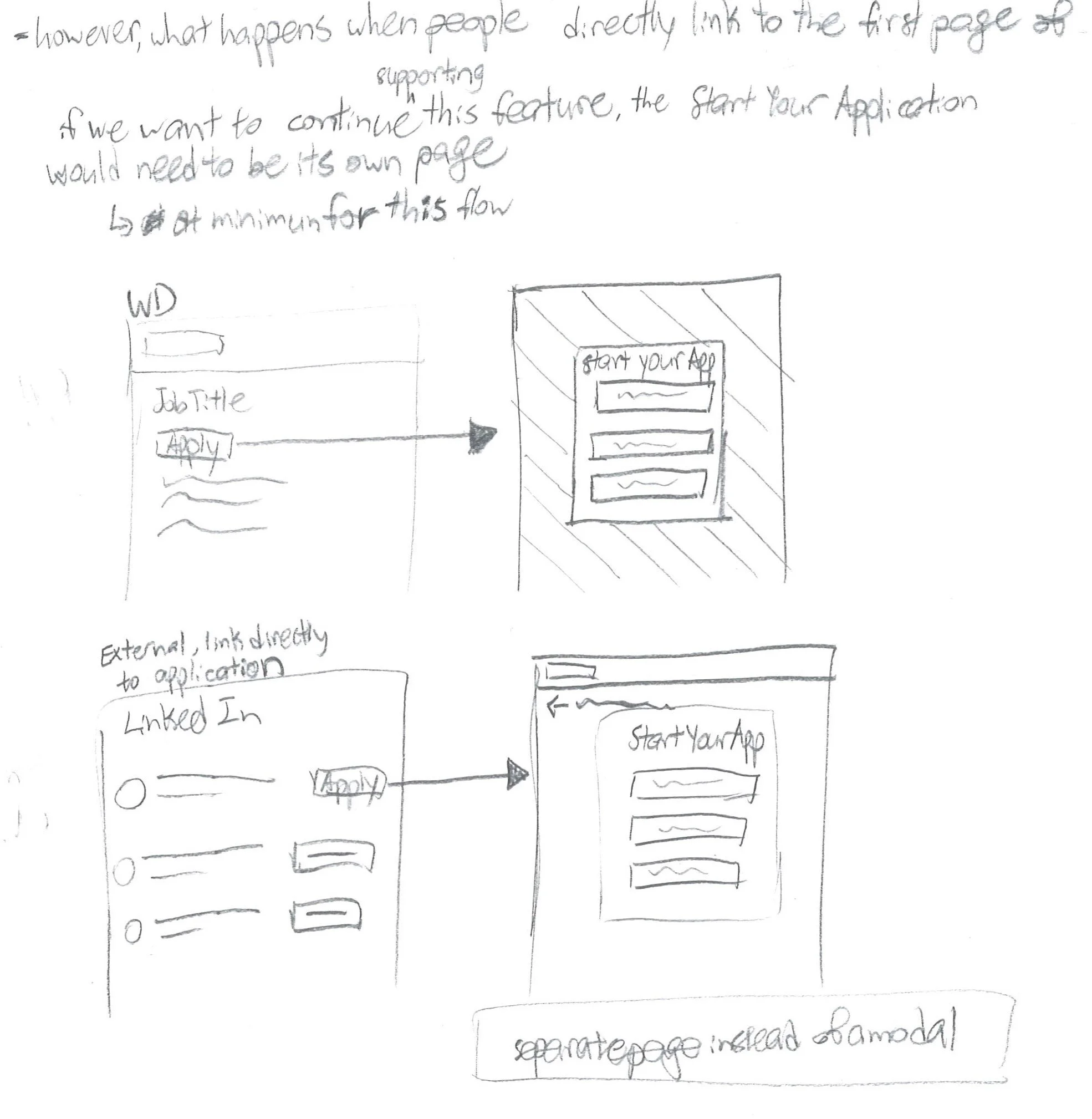
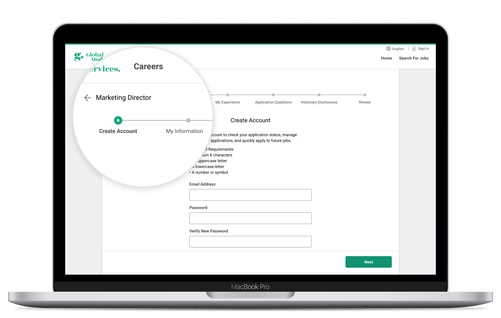
Can’t change the existing flow

The new design must continue to support the same complex configuration as the existing job application. It’s a business requirement that it can’t remove any features or content on the page.

Lack of metrics to measure against

Both Workday’s technology and policies means either the analytics data doesn’t exist or can’t be accessed. I instead relied heavily on formative qualitative data.

All design must be handed off months in advance

Workday runs on 6 month release cycles, so designs need to be ready for hand off at least 7 to 8 months before release. This means that surprise technical limitations or scope cuts are a common occurrence.

Generative User Research

In my Search Page Redesign case study, I included additional research findings that overlap with this project. (Optional read)

generative-interviews.png

Some additional insights we found specifically relating to the job application are:

Lack of transparency

People want to know how long a job application is going to take them and if they have all the information they need to complete it on hand. Ideally, the shorter the better, which leads into…

Long and manual process

Job applications tend to be a high anxiety experience. For someone desperately applying to hundreds of jobs, this can really wear you down. For someone who’s really picky about their next job, they may decide not to complete a job application if it seems tedious.

Many sites support resume parsing to fill your application but most participants didn’t trust it because it rarely works correctly. And the fact that some job sites support ‘quick applying’ makes long and manual applications seem even worse in comparison.

“It would take [me] an hour or more to fill out [some of] these questions.“

“[I’m] discouraged by this process because there’s so much data entry.“

Usability roadblocks

Tons of job applications still run on legacy software that’s borderline unusable. We heard many stories from participants about accidentally submitting incomplete or incorrect information. Sometimes they’re unable to complete the application at all.

“If I ran into a jam on an application I would just stop.“

Audit the Existing Flow

Before redesigning the flow, I had to understand what the current flow is and how it’s set up. I regularly sat down with knowledgeable developers to walk me through the nitty gritty details.

I also got the help of three researchers to do an expert review of the flow. This resulted in many similar insights as listed above, but I had a better idea of where I could tactically slot in design improvements.

Overview of the entire career site’s flow

Overview of the entire career site’s flow

An example of the job application with 3 steps. There can be up to 13 steps configured.

An example of the job application with 3 steps. There can be up to 13 steps configured.

Some Workday specific findings are:

Keep the flow continuous

After clicking Apply, it’s jarring to jump to a separate ‘Create Account’ page then back to the job application. Workday also has resume parsing as the first step of the job application, but it’s not obvious that this is an optional step that can be skipped.

Unusable components

Some dropdowns have so many options that they become extremely difficult to use. Workday also has a ‘Prompt’ component similar to a searchable dropdown, but it’s known for its poor discoverability and usability.

Early Designs

With a solid understanding of the existing flow and pain points, I began to iterate on some early wireframes. I reviewed my ideas within the design team and with product and dev to assess feasibility.

One of the key decisions here was to add a progress bar with clearly visible steps. I also moved account creation to the last step to see if it would increased people’s willingness to create an account.

apply-sketch-1.jpg
apply-sketch-2.jpg
apply-flow-early-wireframe.png

Coded Prototype + User Testing

It quickly became obvious that having participants go through a clickable prototype wouldn’t be real enough for such a data entry heavy flow.

To get more relevant data, I created a coded prototype so users could really experience the pain of filling out a long form. It also allowed me to experiment with helpful interactions such as autocomplete fields, field masking, and a new searchable dropdown experience.

apply-prototype-research.png
 

Research Insights

Have one way to start your application

Changing ‘Resume parsing’ from the first step to one of many ways to start an application better fit participants’ mental model. This eliminated the problem where participants thought it was a required step.

The progress bar was successful, maybe too successful

It successfully oriented participants to their location in the process and set expectations about the length/content types of the application. However, some participants perceived that the application would take significantly more effort. Participants also tried to click on the progress bar to navigate between steps. The prototype did not support this, but they recovered quickly and found the Back button.

Be more transparent

‘Create account’ and ‘Review’ weren’t steps in the progress bar as part of this prototype. Even though most participants said this was common, they were all noticeably disoriented.

Supportive fields usually worked well

Autocomplete fields were a hit. Participants expected them on many more fields, for example, visa status, list of universities, and office locations. Future designs also need to support manual override and edge cases like apartment numbers and different country address formats.

Additionally, not everyone realized that the new dropdown component was searchable. The participants that did try typing had greatly increased efficiency and confidence.

High Fidelity Designs + Handoff

Since I only had the time and resources to conduct one round of usability testing, I shifted to creating handoff ready deliverables. I cleaned up the visual design and integrated the feedback from the usability test.

Clear ways to start your application

Know where you are in the process

See the full process up front. Stay in context the entire time.

Faster ways to complete your application

My Takeaways

Learning to work with constraints

Whether it’s the complex setup of the system which can’t be changed or the legacy technology you’re building with, you have to make do with what you have. I’ve got a better sense of how to make the maximum amount of impact given a limited scope now. Tight constraints can also be a great catalyst for creative workarounds.

Outcome

Based on our qualitative user testing, the redesign successfully gave job seekers a more efficient and predictable job application experience.

In regards to the goal of increasing customer satisfaction, my product managers regularly held focus groups with twenty heavily invested customers throughout the project to share out work-in-progress designs, gather feedback, and build trust.

Workday also held their annual Rising conference where PMs presented the new designs to conference goers to build excitement and trust in the future of the product.

The job application is planned to be released in two phases over the next year. There’s still conversations about what features are feasible to support, for example using the progress bar to skip steps or Google Maps address autocomplete. Once the redesign is fully released, I’m hoping to run an expert review or benchmark user test to compare it to the old flow. Because of our lack of analytics data, we’ll continue to use qualitative methods to evaluate this product.


Next Case Study

Vivid
Information capture app for law enforcement

Read Case Study